Evernote Growth
Designing to move metrics, one experiment at a time
Evernote is a note taking and productivity app that allows users to capture and remember anything. On the surface, a person who doesn’t know anything about Evernote may just see it as a simple note taking app that can be easily replaceable by a simple text editor.
As many millions of Evernote users will attest, however, Evernote is more than just another note taking app, it’s their second brain. It’s where their professional and personal lives collide and the toolkit that is their constant through different jobs and different phases of their life. Their Evernote contains everything from 1-1 meeting notes to wedding vows to web clips of their favorite recipes, and even scans of their children’s artwork. Because of this, Evernote’s biggest challenge has always been how to help both new and existing users tap the potential of Evernote.
As a lead designer on Evernote’s Growth team, my role involved designing activation, engagement, and conversion experiments to help explain the value of Evernote and our premium offerings, increase our metrics, and overall, our bottom line. From small micro-experiments to big mountain experiments, we ran multiple tests every sprint to try to move our metrics.
Role: Design Lead & Product Designer
Areas: Acquisition (minor), activation, engagement, & conversion
Team: 3 PMs, 10-15 Engineers, 3 Designers, 3+ QA, 1 analyst
Partners: Collaborated 2 product teams & 6 other designers on a need basis
Platforms: Windows, Mac, Web, iOS, & Android
Experiments: Varied (Many little mountain and some big mountain tests)
Timeline: March 2018 - June 2019
Here are just a fraction of some of the tests I worked on as a growth designer.
The “New” First Launch Experience
Case Study Coming Soon!
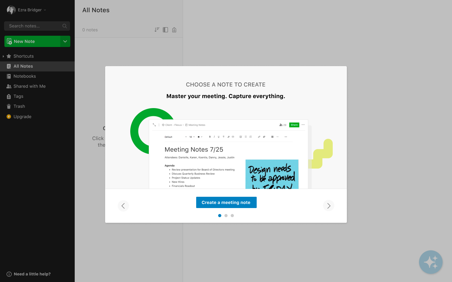
When we started seeing diminishing gains running small incremental tests in our onboarding experience, we decided to try a radically new approach to our onboarding flows. This test shifted us away from the mindset of “How do we teach users about everything Evernote has to offer as quickly as possible” to “How do we get users to create a meaningful note as quickly as possible?”
This quantitative test increased day 0 note creates, a key engagement metric, and became the new baseline that is still built on today.
Personalizing Onboarding Experiences
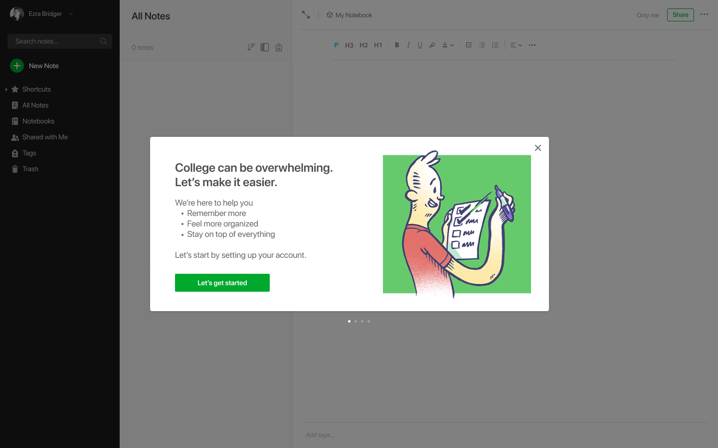
In this project we ran multiple user studies to understand the benefits and downfalls of a personalized user experience for 3 main use cases: Personal, Work, and School.
The results from this qualitative test lay the foundation for our future quantitative personalization tests which is a part of the baseline today.
Buy vs Try vs Try & Buy on the Device Paywall
Case Study Coming Soon!
One of Evernote’s highest conversion paywalls is the Device Paywall. Basic users who attempt to use Evernote on more than 2 devices will see the paywall and those that are eligible are often given a free trial. In this experiment, we wanted to test whether offering users both a buy & try option in the same screen would result in a higher LTV than no offer or offering a trial only.
Savings treatment color
Not all experiments have to be big changes. The cheapest successful experiment I ran involved just a simple color change. Working under the assumption that there was too much green in our app and users easily overlooked our savings callout, we experimented a winning variant in which we switched our savings callout color to blue and increased conversions in this paywall flow.


